
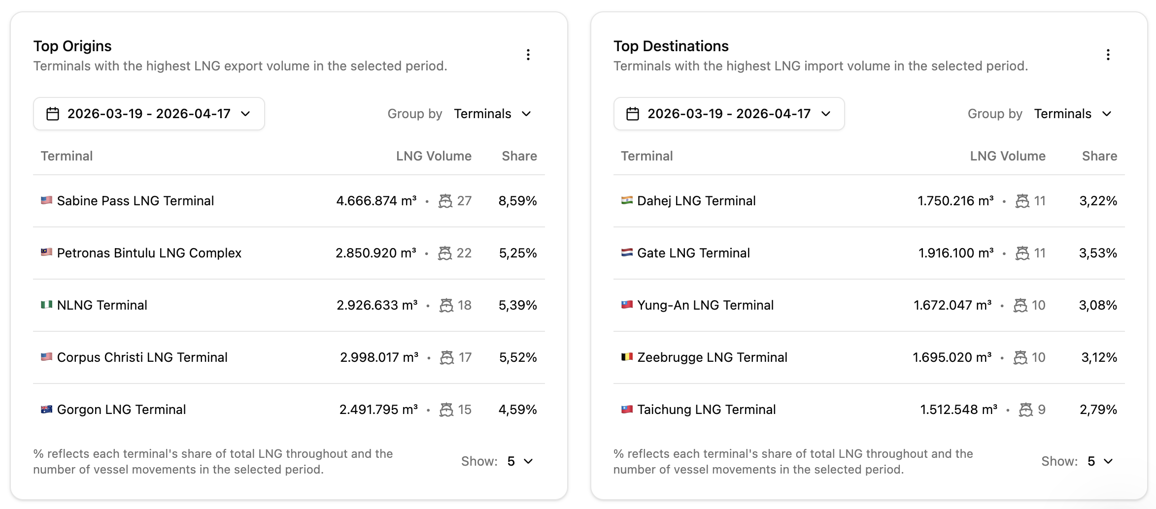
Data is only as valuable as the context it provides. In our final deep dive into the Orbify dashboard, we explore the Geographic Intelligence layer. By ranking the top export and import terminals, Orbify provides a clear map of the global LNG flow, highlighting the strategic nodes that power the industry.
1. Top Origins: Identifying the Supply Engines
The Top Origins table ranks terminals by their total export volume. This is a vital tool for understanding where the global supply is concentrated.
Market Share Analysis: Orbify automatically calculates the "Share" percentage for each terminal. For instance, seeing Sabine Pass LNG at an 8.59% share with 27 voyages confirms its role as a global powerhouse.
Operational Benchmarking: By observing the ratio between volume and voyage count (e.g., 4.6M m³ over 27 voyages), operators can estimate the average cargo size moving through specific hubs, aiding in vessel-to-terminal compatibility planning.
2. Top Destinations: Tracking the Demand Pulse
The Top Destinations table provides the flip side of the coin, showing exactly where the molecules are being delivered.
Regional Dominance: Whether it is Gate LNG in the Netherlands or Dahej in India, tracking the top destinations allows traders to spot shifts in regional demand.
Congestion Forecasting: A high concentration of voyages toward a single destination (like 11 voyages to Dahej) can be a lead indicator for potential port congestion or discharge delays, allowing you to re-route vessels if necessary.
Ranking the world's most active LNG hubs. Orbify translates thousands of AIS data points into a simple, ranked list of market leaders.
3. The Power of "Group By"
One of the most flexible features of this module is the "Group by" toggle. The system allows users to re-aggregate data to see performance by terminal, country or region, providing a macro-view of global trade shifts.